All projects
UX/UI
UX Research
Restructured Sitemap
Volunteer Project
A redesigned and restructured website that improves how users discover and adopt pets by making information clearer, navigation more intuitive, and the adoption process easier to understand.

I started this redesign while volunteering in the cat area at the Helenenhof animal shelter. Each time I tried to find information on their website, I struggled with its outdated layout, chaotic structure, and lack of a mobile version.
I decided to redesign the entire website as a volunteer project, taking full ownership of the process — from user research and information architecture to wireframing, UI design, testing, and full implementation in Webflow.
The website no longer reflected the warmth of the shelter, or supported people who wanted to adopt, donate, or help.
GOAL
Help visitors quickly understand how they can help, discover pets' stories, and feel encouraged to get involved — without unnecessary effort.
MY RESPONSIBILITIES
UX/UI Design
Information Architecture
Webflow Implementation
User Research & Testing
Before starting the redesign, I conducted an online survey to understand how users perceived the old website. The goal was to uncover what users expected from a modern animal shelter website and identify the biggest pain points.
Why users visit:
People come to adopt pets or find general information. Pet profiles are informative and help create a bond between visitors and the animals.
Navigation challenges:
Overall navigation is not fully intuitive. Users particularly struggle with finding information about volunteering or becoming a member.
Trust & Credibility:
Missing images, inconsistent layout, and incomplete information reduce users’ trust in the website, even though it is somewhat credible.
Homepage & Engagement:
The homepage feels boring and doesn’t immediately engage users or reflect the warmth and character of the shelter.
User personas
Two personas emerged from the survey: Emma, the adopter, and Lukas, the helper/donor.

Emma Schmidt
📍 Cologne, Germany
GOALS:
Find a pet to adopt that fits her home and lifestyle
Learn about the pets’ personality, needs, and health
Access the adoption process without confusion
FRUSTRATIONS:
Outdated, non-responsive website
Homepage and navigation not engaging or intuitive
Adoption info is hard to find
“I want to find a pet that will stick to my soul, without getting lost and confused in the process.”

Lukas Weber
📍 Hürth, Germany
GOALS:
Learn how to volunteer, donate, or become a member
Access relevant shelter support information
Feel connected to the animals and the shelter community
FRUSTRATIONS:
Information is scattered and sometimes missing
Interface feels cold and uninviting
“I want to help the shelter, but I shouldn’t have to dig through an outdated site to figure out how.”
The new sitemap introduces a clear and concise hierarchy structured around primary navigation, reflecting how users naturally access information.

Sitemap
Before moving into digital design, I worked on paper sketches to give my ideas structure without being distracted by visual details. These wireframes helped me explore key user flows for both desktop and mobile.

Paper sketch

Paper sketch
Based on the client's wishes and user research, I developed a concept focused on clarity, warmth, and emotional connection. A friendly and cozy interface with soft shapes and nature-inspired colors felt right to represent the shelter.

Moodboard

UI elements & design system
Low-fidelity wireframes helped translate early ideas into a clearer structure, focusing on layout, hierarchy, and user flows before moving into high-fidelity design.


The first iteration used a warm orange theme — approved by the client before testing began. After further discussion, the palette was refined to green tones from the original brand. Both versions are shown here because the orange theme captured the shelter's warmth so well.


After completing the first design iteration, I conducted an online usability and perception survey to validate the concept, navigation, and overall user experience before implementation.
100 %
Positive or very positive first impression
↑ High
Task completion rate across all tested scenarios
3
Key navigation improvements identified for next iteration
Participants described the website as warm, friendly, and trustworthy — qualities essential for an animal shelter.
Based on user feedback, stakeholder discussions, and design constraints, several refinements were made before final implementation.
Color palette — adjusted to green tones and refined supporting colors for visual harmony with the shelter's existing identity
Navigation — simplified and condensed for better scannability and fewer clicks to key content
Search over language switch — replaced the language toggle with a search bar to improve content discoverability
Logo preserved — kept the shelter's existing logo to maintain recognisability and continuity
Content reorganisation — selected sections regrouped for improved clarity and logical flow
A fully responsive, user-centered website that improves clarity, accessibility, and emotional engagement — supporting users in making informed and emotional decisions while reflecting the shelter's values.
scroll within the cards below to view more
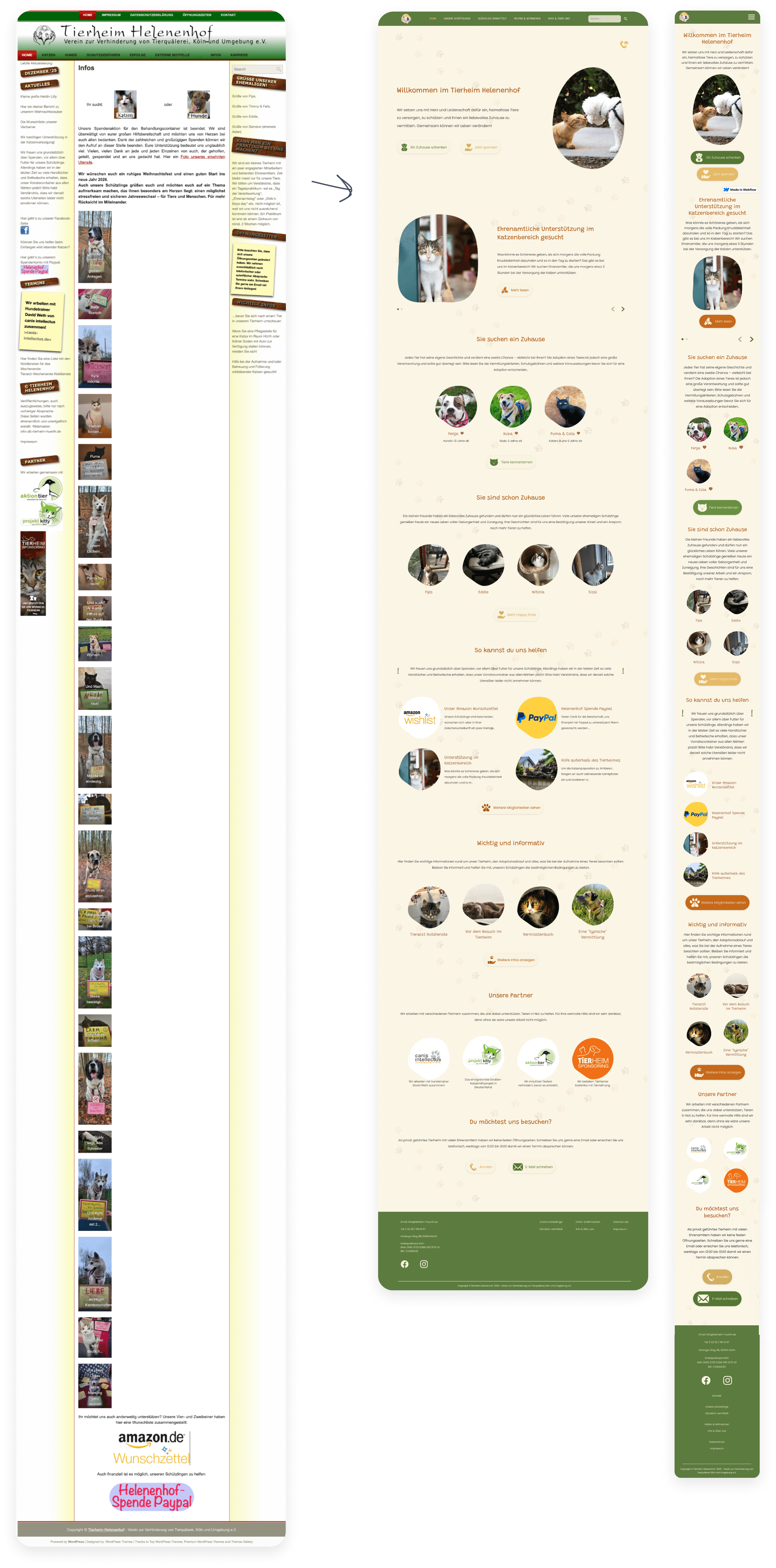
Home page — clarity, emotional entry, and primary actions
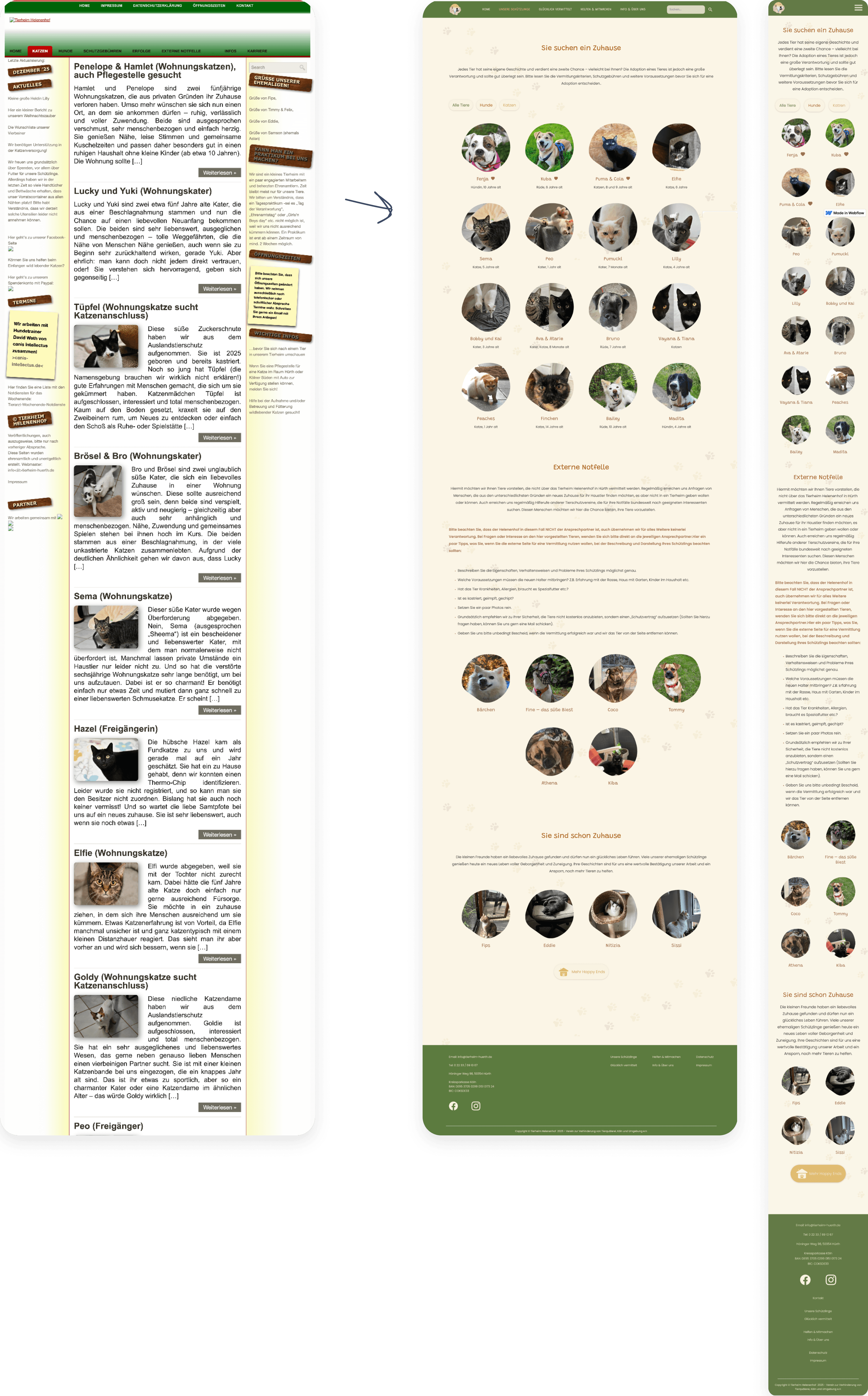
Pets to adopt — improved scannability and filtering
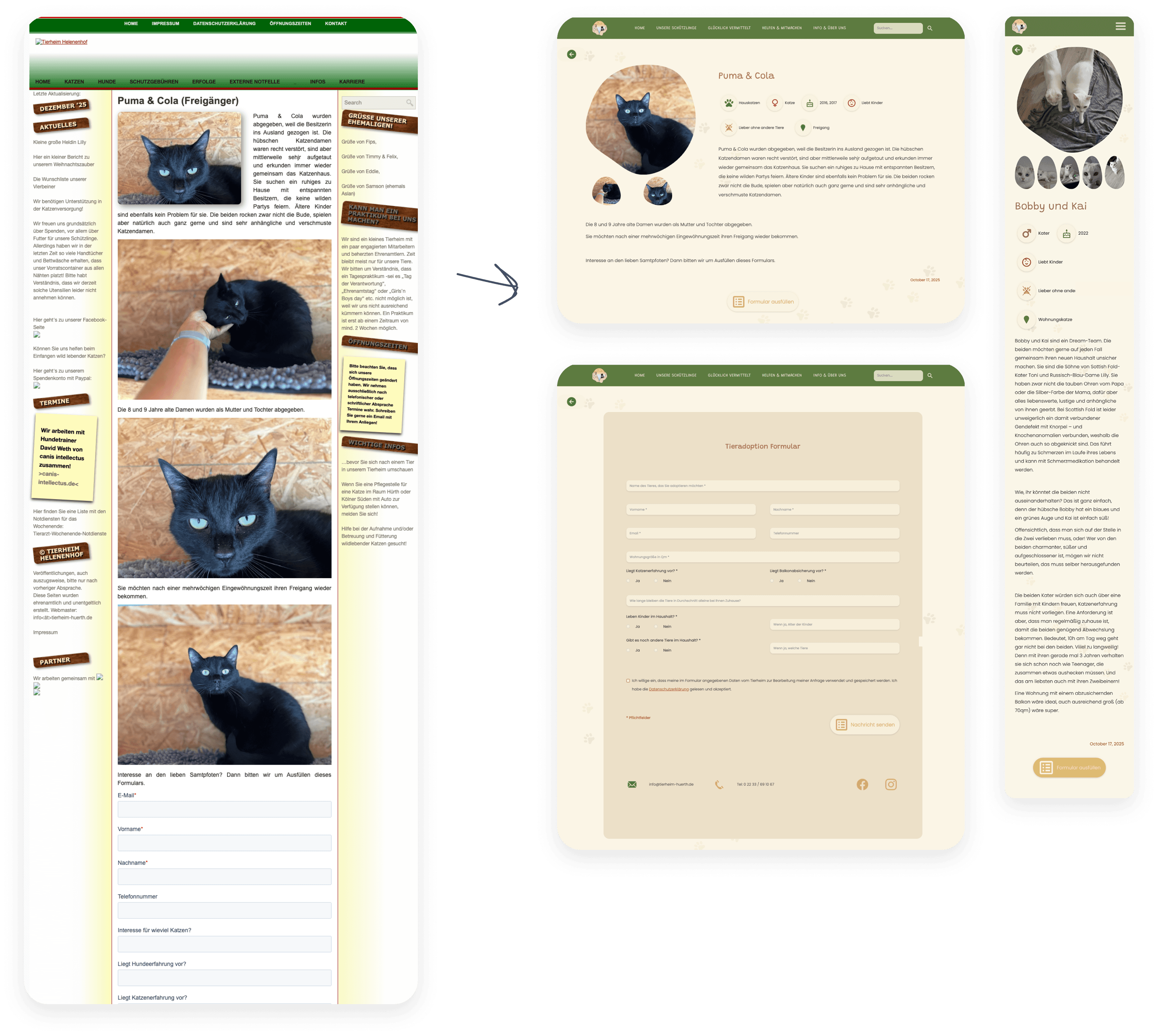
Pet detail & adoption form — clear information hierarchy
The original website had no mobile version. Ensuring accessibility across all devices was one of the core goals of the redesign.


Being aware of biases
Working as designer, architect, and developer — while also being a website visitor and shelter volunteer — made it essential to continuously separate personal experience from user needs. Design decisions had to stay grounded in research, not assumptions.
Flexibility & iteration
User testing validated core structural decisions, while stakeholder feedback shaped the final visual direction. Implementing in Webflow revealed practical considerations not always visible in static designs — reinforcing how UX extends beyond design tools.